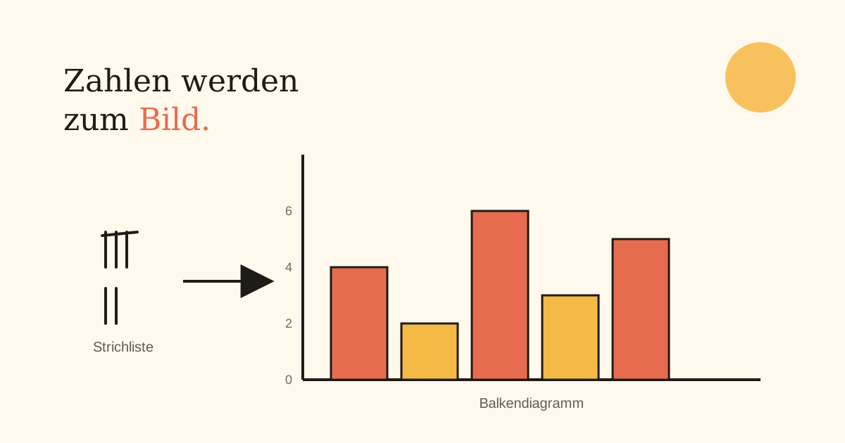
A tally chart shows the raw numbers: five marks here, eight marks there. A bar chart shows the same thing as a picture — and a picture can be compared at a glance, without recounting every single mark. The step from list to chart isn't a side topic; it's the actual point of counting in the first place — numbers only become genuinely useful once they can be compared at a glance.
A hand-drawn bar chart only needs a handful of fixed rules — once those click, any tally chart can be turned into a diagram.
The two axes: what goes where
Every bar chart has two axes with clearly separate jobs. The horizontal axis (x-axis) lists the categories — the days of the week, say, or the class's favourite colours. The vertical axis (y-axis) shows the frequency — how often each category comes up. One bar per category, its height showing the count.
The scale of the y-axis
Before drawing the first bar, it's worth a moment's thought your child already knows from reading maps: what scale fits the page? If the values range from 0 to 8, each grid step can stand for 1. If they range from 0 to 40, steps of 1 would make the chart far too tall — a step of 5 or 10 per grid square reads far better here. Just like with a map's scale: the bigger the numbers, the bigger the step per square needs to be for everything to fit on the page.
Three steps to a finished chart
This is how a tally chart becomes a diagram:
- Step 1 — label the axes: categories on the x-axis, a sensible scale on the y-axis.
- Step 2 — draw the bars: one bar per category up to the right height, all the same width.
- Step 3 — give it a title: a chart with no title doesn't answer any question — the title says what it's even about.
The most common mistake
Bars of different widths, or spaced unevenly apart, make a chart look wrong at first glance even when the heights are correct — the eye compares areas, not just heights. The second common mistake: a grid step that changes partway through, say starting in steps of 1 and switching to steps of 5. That makes the bar heights impossible to compare with each other, which defeats the entire point of a chart.
What your child can already build on
A child who already keeps tally charts has done the actual counting work already — the chart just translates what's already been counted into a picture. And a child who can read a map's scale brings exactly the instinct the y-axis needs too: a quantity mapped onto a smaller but evenly spaced set of steps.
How to practise this at home in 10 minutes
A few drills that need no worksheet:
- Count the colours of cars passing the window over 5 minutes, then draw the results as a bar chart.
- Take a tally chart from school (if there is one) and turn it into a chart together.
- Ask 10 family members or friends for their favourite fruit and plot the results as bars.
- Try two different scales for the same data and compare which chart reads more clearly.
What Talentists does differently
Our worksheets don't just have your child read finished charts — they draw their own from data they've collected themselves, including deciding which scale fits, because that decision is exactly what shows whether the principle has genuinely clicked.